Introduction
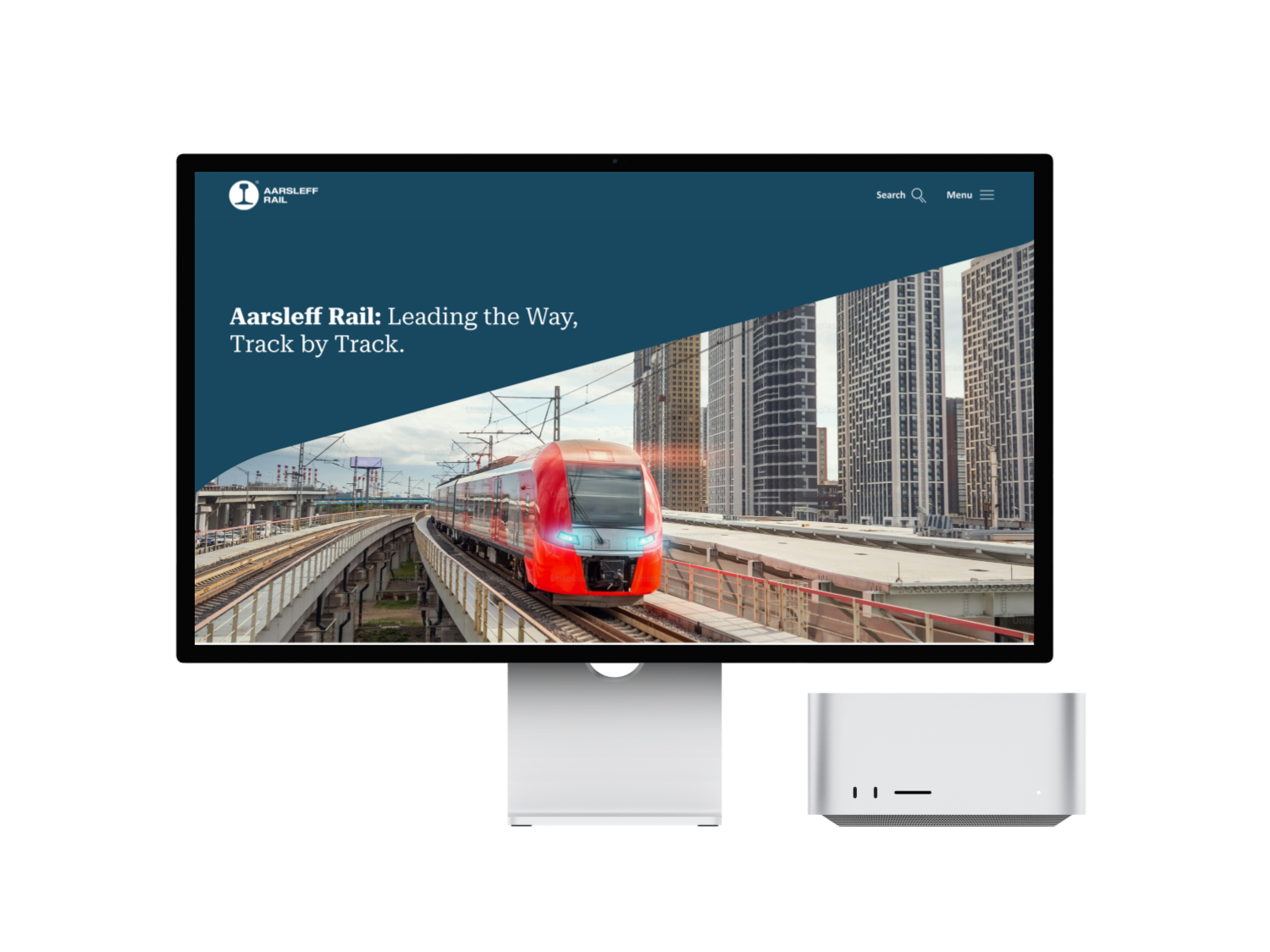
Aarsleff Rail, a leading player in the Scandinavian railway industry, had a digital presence that hadn’t been updated in nearly a decade. Their website was outdated, clunky, and didn’t reflect the company’s evolving values or the dynamic market it operates in. The challenge? To create a modern, user-friendly website that would not only align with their new visual identity but also make it easier for users to connect with the company and explore their services.
This project was an opportunity to dive deep into the world of UX/UI design, combining research, strategy, and creativity to deliver a website that would serve as a digital flagship for Aarsleff Rail. Over the course of this individual thesis project, I tackled the challenge of redesigning the website, ensuring it reflected the company’s professionalism, innovation, and commitment to customer satisfaction.
The Challenge
The challenge was clear:
How can I redesign the Aarsleff Rail website, focusing on improving design and user experience, while seamlessly incorporating the company's new visual identity?
The existing website was like an old, overstuffed closet—full of important things but impossible to navigate. It wasn’t responsive, the navigation was confusing, and the design didn’t match the company’s new branding. My goal was to turn this cluttered digital space into a sleek, intuitive platform that would not only attract users but also make them want to stay and explore.
Research & Discovery
To tackle this challenge, I started with research—lots of it. I wanted to understand the current state of the website, the company’s goals, and the needs of its target audience.
Methods Used
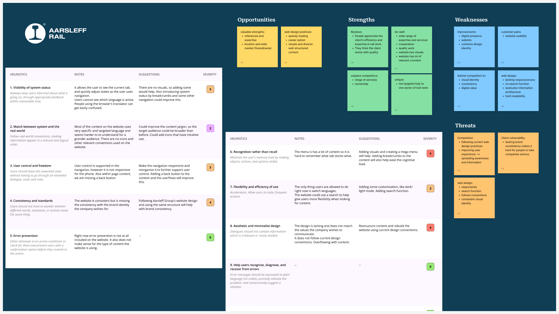
- Heuristic Evaluation — I conducted a heuristic evaluation of the existing website, identifying key usability issues like cognitive overload, lack of responsiveness, and inconsistent visual identity.
- SWOT Analysis — This helped me understand Aarsleff Rail’s strengths, weaknesses, opportunities, and threats in the digital space.
- Competitive Audit — I analyzed competitors’ websites to see what they were doing well (and where they were falling short).
- Customer Segmentation — I segmented the target audience to better understand their needs and pain points.
Key Findings
- The website wasn’t responsive, making it a nightmare to use on mobile devices.
- Navigation was a maze—users had to dig through layers of content to find what they needed.
- The visual identity was inconsistent with the company’s new branding.
- Users wanted easier ways to contact the company, find information, and explore services.
UX Strategy & Mapping
With these insights, I developed a UX strategy to guide the redesign process.
Key Components
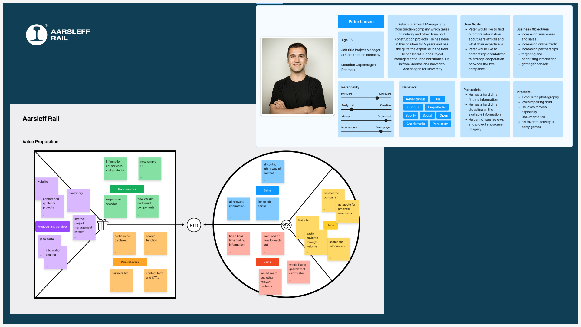
- User Persona — I created a user persona, Peter Larsen, a project manager in the construction industry, to represent the primary user. This helped me focus on the needs and goals of the target audience.
- Value Proposition Canvas — This tool helped me align the website’s features with the needs of the users and the goals of the company.
- Information Architecture — I restructured the website’s content to create a more intuitive and user-friendly navigation system.
Mapping the User Journey
I mapped out the user journey, identifying key touchpoints where the website could add value. This included tasks like finding services, reading about projects, and contacting the company.
Ideation & Concept Development
With a clear strategy in place, I moved into the ideation phase, using creative methods to generate and refine ideas.
Methods Used
- Crazy 8s — I used this rapid sketching method to brainstorm layout ideas for the website.
- Mid-Fidelity Prototyping — I skipped the low-fidelity phase and created a mid-fidelity prototype to incorporate the new visual identity from the start.
- Design System — I developed a design system with reusable components to ensure consistency across the website.
Key Features
- Responsive Design — The website was designed with a mobile-first approach to ensure it worked seamlessly across all devices.
- Improved Navigation — I introduced a mega navigation bar and breadcrumbs to make it easier for users to find information.
- Content Diversity — I added visuals, testimonials, and interactive elements to make the website more engaging.
- Contact Form — A prominent contact form was added to encourage user engagement.
Testing & Validation
To ensure the design met user needs and business goals, I conducted extensive testing.
Methods Used
- Usability Testing — I tested the mid-fidelity prototype with users to gather feedback on usability and functionality.
- Expert Testing — I sought feedback from UX designers, graphic designers, and front-end developers to refine the design.
- Readability and Accessibility Testing — I used the Ally plugin to ensure the website was accessible to all users.
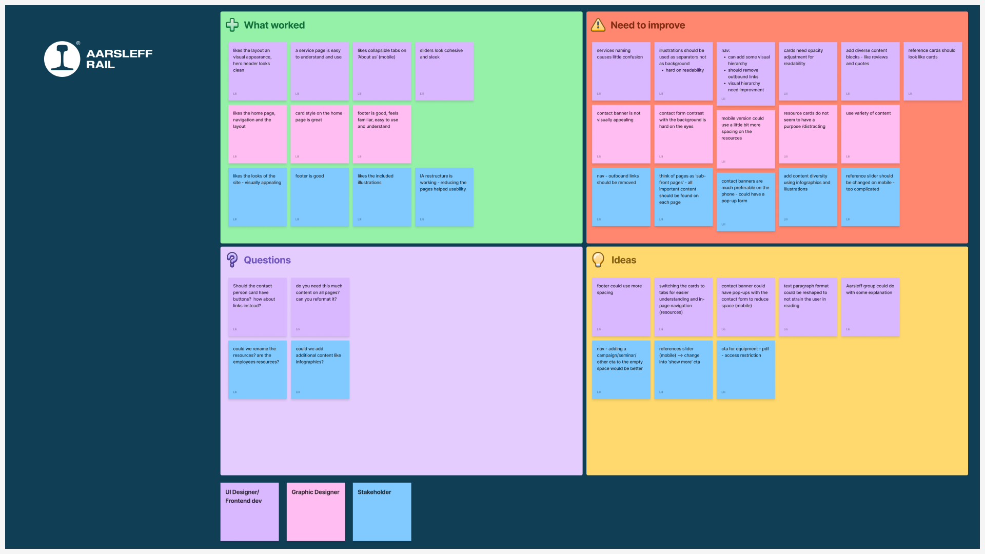
Key Feedback
- Users appreciated the clean design and intuitive navigation.
- Some elements, like the mobile service cards, needed resizing for better usability.
- The contact form required better contrast for improved visibility.
Iterative Improvements
Based on the feedback, I made several adjustments, including
- Resizing mobile service cards.
- Enhancing the contrast of the contact form.
- Adding more visuals and interactive elements to improve engagement.
Takeaways & Reflection
Key Takeaways
- User-Centered Design — By focusing on the needs of the target audience, I was able to create a website that was both functional and engaging.
- Iterative Testing — Continuous feedback and iteration were crucial in refining the design and ensuring it met user needs.
- Visual Identity — Incorporating the new visual identity from the start helped create a cohesive and professional look.
Reflection
This project was a challenging but rewarding experience. It taught me the importance of balancing user needs with business goals and the value of iterative testing in creating a successful design. I also learned how to effectively use AI tools like ChatGPT and Strut AI to streamline content creation and brainstorming.
Looking back, I’m proud of the work I’ve done and excited to see how Aarsleff Rail’s new website will help the company achieve its goals. This project has not only enhanced my skills as a designer but also deepened my understanding of the importance of user-centered design in creating impactful digital experiences.



.svg)